
First, here are some ideas for the main icon/symbol of the logotype itself. They are basically rooted in making a stylized “M” out of the rotors inside the superchargers, while still looking cool and “logotype”-syled.
The current “M”-symbol you use today is basically just a typed out M from a standard font, might even bee a free font at that. All of these are hand drawn and not from a font, adding to their uniqueness.
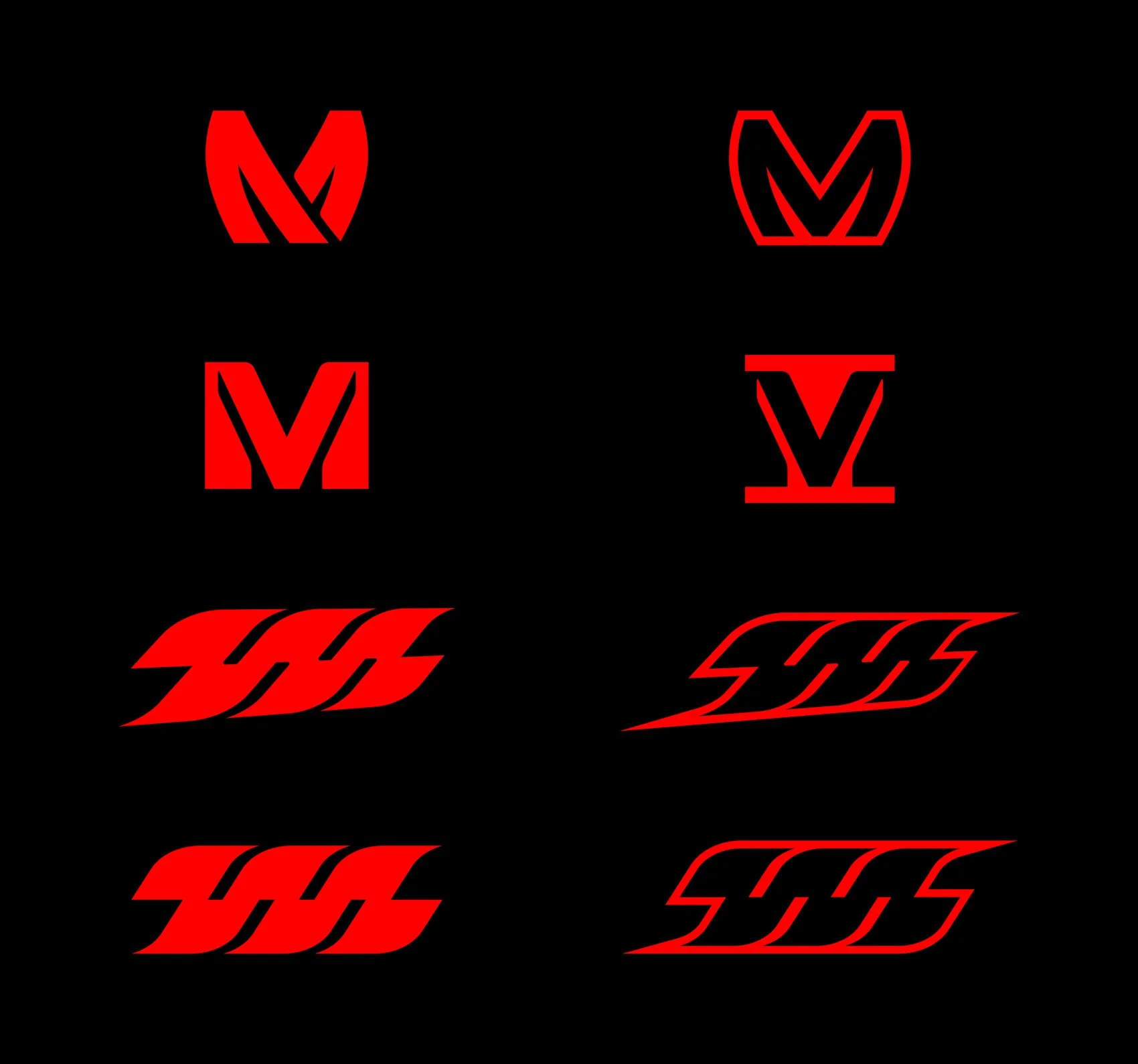
Moving on to the text part of the logo. These are not as much of a heavy redesign of the current one, as we don’t want to stray too far from the current text and feel of it. But these are more strong, angular and “robust” than the current font. That said, I am definitely open to making more variants if you want, as this is almost the same idea in different versions.

And finally, combining the symbol with the text - note that these combinations of the symbol and text are just examples, you can combine any symbol with any text of course, but making every combination would take too much time and space. If you want to see a specific combination of the symbol and text, just let me know.
